Beyond a simple listing of metrics, this guide introduces the key components and usage methods of the AppMon dashboard, which visually and dynamically expresses activities occurring within the system.

Dashboard Component Specifications
1. 3-Tier Intelligent Tab Navigation (Group - Node - App)
- Node Group Tabs (Group Tabs): Logically separates and manages server groups or clusters. Connection states of each group are immediately verifiable via real-time lightning indicators.
- Node Tabs (Node Tabs): Switches between physical/logical server nodes (
Node-1,Node-2, etc.) within a specific group. Visualizes major gauge metrics and survival status for each node. - Application Tabs (App Tabs): Switches between individual application contexts (
App 1,App 2, etc.) running on a specific node. Monitoring data is seamlessly synchronized even during tab switches, allowing you to resume observation instantly.
2. Server Resources & Performance Monitoring
- Real-time Resource Metrics:
- CPU Usage: Measures JVM process CPU usage, host system CPU usage, available processor cores, and system load average in real time (
CpuUsageReader). - Heap Status: Displays current JVM heap memory usage against maximum limits to detect GC states and memory leaks (
HeapMemoryUsageReader). - Thread Pool Status: Monitors Undertow or Netty server thread pool resources (
UndertowThreadPoolMetricsReader,NettyThreadPoolMetricsReader). Compares active threads (including Virtual Threads) against total pool capacity to monitor concurrent server load. - Separated Unit Display: Visually separates metric values from measurement units (
%,MB,ms, etc.) and displays units in a compact, subtle style to maximize numerical readability.
- CPU Usage: Measures JVM process CPU usage, host system CPU usage, available processor cores, and system load average in real time (
- Activity Status (Real-time Activity Counts): Provides numerical request processing status for each server application.
- Active Activity: Number of real-time activities currently being processed concurrently on the server (e.g.,
11). - Current Period Count: Number of activities ingested during the current 5-minute aggregation period (e.g.,
+94). - Cumulative Total: Total cumulative activities recorded to date (e.g.,
12883893).
- Active Activity: Number of real-time activities currently being processed concurrently on the server (e.g.,
- 5-Minute Period Aggregation Management: The timer displayed at the bottom of the numbers (e.g.,
280/300) indicates the progress of the 5-minute (300-second) data aggregation interval. Upon reaching300/300, aggregated period data is saved to the server DB, reflected in analysis charts, and the period resets. - Statistical Summary: Periodically saved data is permanently recorded on the server, allowing users to analyze historical trends and current status side-by-side in time series.
3. Metric Trend Visualization (Inline Sparklines & Detail Popover Charts)
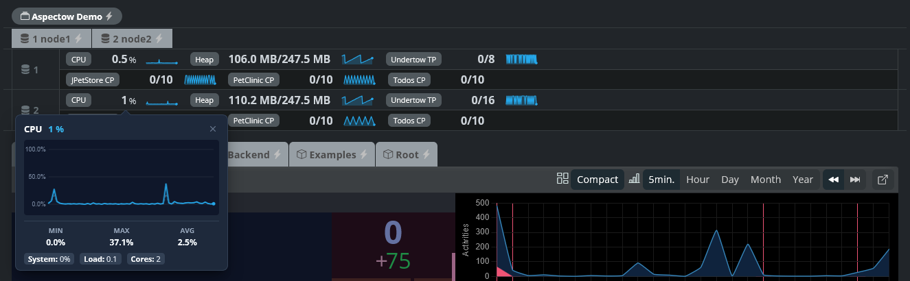
The Metrics Bar located at the top of the dashboard and on each application card goes beyond merely presenting static current numbers; it provides dynamic visualization capabilities that allow operators to intuitively observe the real-time trend of metrics (retaining the most recent 60 incoming data points) while the dashboard remains open.
- Inline Sparklines:
- Real-time Mini Trends: Renders compact trend lines, gradient fills, and latest-point dots to the right of each metric value, making rising and falling resource tendencies identifiable at a glance.
- Threshold Alert Visualization: When heavy system load is detected—such as CPU usage surging to 85% or higher—the sparkline color automatically transitions from default blue to alert red, instantly signaling potential risks.
- Interactive Detail Popover Mini Charts:
- One-Click In-Depth Analysis: Clicking on any metric item opens an anchored floating popover card that presents a detailed historical trend (closed via outside click, close button, or
ESCkey). - Precise Time-Series Chart & Gridlines: Plots the data trajectory of the recent 60 points alongside precise gridlines and value labels, allowing operators to visually inspect exact fluctuations.
- Composite Dual Metric Visualization (Primary / Secondary):
- CPU Usage: Concurrently displays JVM process CPU usage (solid line) and host system CPU usage (dashed line).
- Heap Memory: Plots currently used memory (solid line) alongside maximum allocated memory capacity (dashed line).
- Thread Pool: Compares actively working thread counts (solid line) against total pool capacity (dashed line).
- Real-time Statistical Summary (Min / Max / Avg): Dynamically computes and displays the Minimum (Min), Maximum (Max), and Average (Avg) values accumulated during the current active monitoring session.
- Detailed Attribute Breakdown: Presents in-depth underlying properties—such as CPU core count and system load average, precise heap KB measurements, thread pool queue backlog, and worker names—as clean chip tags at the bottom.
- One-Click In-Depth Analysis: Clicking on any metric item opens an anchored floating popover card that presents a detailed historical trend (closed via outside click, close button, or
4. Canvas Traffic Flow Visualization (Traffic Flow)
All user requests (Request/Activity) are visualized as ‘bullets’ flying from left to right across the screen. Powered by a high-performance delta-time engine, it maintains smooth animations even under heavy loads of thousands of concurrent requests.
- Dynamic Visualization Logic:
- Speed vs. Response Time: As response time increases, bullet speed decelerates up to 60%. This is an essential mechanism for visually experiencing system congestion.
- Persistence: The duration a bullet remains stuck to the right wall before disappearing is proportional to the actual server response time. In other words, requests that took longer remain on screen longer, drawing the operator’s attention.
- Hotspot & Hot Core: Requests from heavy users with an Activity Intensity exceeding 0.3 generate a Hot Core center inside the bullet for immediate identification.
- Status Color Coding:
- Green: Normal requests processed at standard speeds.
- Yellow: Warning requests where response time starts to lengthen (500ms or higher).
- Red: Requests where an error occurred during processing.
- Data Synchronization: All activity data is aggregated in 5-minute intervals, stored on the server, and immediately reflected in dashboard analysis charts.
5. Session Status & User Activity Management
- Real-time Session List: Provides a list of session information for currently connected users.
- Country Identification: Displays country flag icons based on session IP addresses to help understand user distribution.
- Activity Count: Displays real-time activity counts for each session to monitor heavy users instantly.
- Session Statistics: Provides a summary card section showing the flow of Active, Peak, Created, and Expired sessions at a glance.
6. Multi-dimensional Analysis Charts
- Activities & Sessions Chart: Displays time-series trends for real-time request volume and session changes.
- Flexible Time Units: Easily toggle between 5 Minutes (Default), Hour, Day, Month, and Year units to analyze everything from short-term traffic spikes to long-term usage patterns.
7. Professional Log Console & History Exploration
A high-performance console that streams server logs in real time.
- Real-time Tailing & Control: Offers zero-latency log streaming via socket connections alongside Pause, Clear, and Full-screen expansion controls.
- Load Previous Logs (Reverse Infinite Scroll): Enables a ‘Load Previous Logs’ button when users scroll to the top of the log box. This provides a powerful history tracking feature, allowing users to scroll backward into past log data to inspect context even during live streaming.